Testing Users for Online Document Submission
A customer applies for an online loan through Check Into Cash. That customer submits personal information to a decision engine that approves them for a loan amount. The customer now needs to submit documentation to verify their identity and income information that they submitted in the online application. The user needs an intuitive way to track and submit multiple documents.
Goals:
- The user needs to know what documents to submit
- The user needs to track which documents have been submitted and which are still outstanding
- The user needs to know when all required documents are submitted
- The user needs to know which, if any, documents fail verification and next steps
- The user needs to know when all documents have been verified by Check Into Cash
The Prototype Design
I gathered up the list of total documents that could be required for applicants. Retail store procedures already defined these. My first wireframes were individual submission screens, but these proved cumbersome across 8-10 documents.
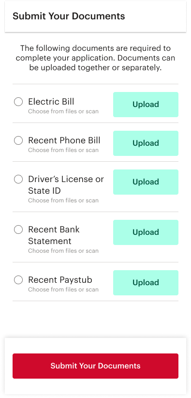
My next designs used a document list, with separate "upload" and "submit" functions. This method is similar to mobile check deposit features in modern bank apps. This list of documents could inform a user of the required documents.
Next I designed list item states in order to demonstrate to the user the stage of upload, submission and approval for the documents on his/her list. The states were originally assumed to be: "to-do", "uploaded", "pending" and "verified". I also assumed than an error state would be needed,
The Testing
A test group of 5 subjects was gathered for an observed test. I built a prototype of the most recent design and users were asked to solve for 3 tasks. Videos and responses were recorded on usertesting.com
Tasks 1 and 2: Upload Drivers License and Bank Statement
The first two tasks of the test commanded the user to upload a document. The first asked for a drivers license (hypothetical) using the native camera app on their phone. The second asked for a bank statement stored in a file sharing app (also hypothetical).
I needed to test the intuitive ease of the camera interface. The user needed to select "Upload" next to the appropriate document, then select Camera from the native list of sources. They then needed to use the camera interface to take two photos and upload the document. I also needed to test that users could discern the various methods that they could access the necessary documents.
Results: Success
All users successfully selected the appropriate list item to upload.
All users successfully chose the correct source.
All users successfully captured photos and selected files from directories.
All users intuitively understood how to add a second photo.
All users successfully selected Upload at the appropriate time.
NEXT
Question: "Have You Submitted Your documents?"
I needed to test users' understanding of the visual cues in the interface.
I needed to test users' understanding of the terms "upload" vs "submit" as they appear in this interface.
Results: Success
All users answered correctly that their documents had not been submitted.
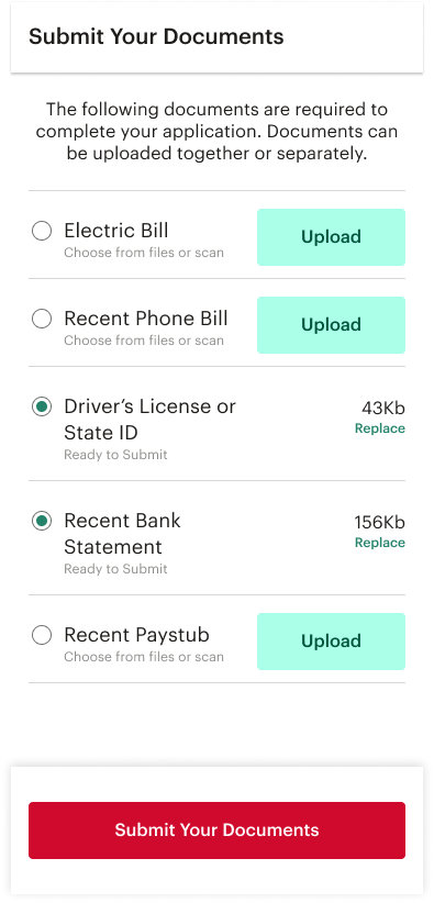
Most commented directly that the drivers license and the bank statement had been uploaded and "are ready to submit". This indicates these visual cues are successful.
Task 3: Submit Your Documents
I needed to test the big red button.
Results: Success
All users selected the big red "Submit Your Documents" button.
NEXT
Respond: "Please identify 2 or more documents that have NOT been submitted."
I needed to test the different visual cues that indicate document status.
Results: Success
All users were able to list two documents in the list that had not yet been submitted. (Electric Bill, Phone Bill, Paystub)
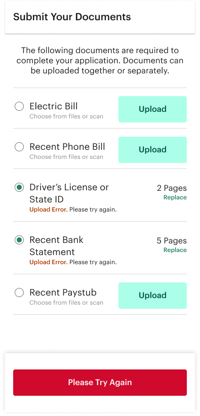
Question: "Describe the status of the drivers license and what you might need to do."
I needed to test the user's understanding of icons, the language "Not Verified" and the "Replace" button. The user should respond that the drivers license had been submitted for verification, was not verified and needed to be replaced by a new copy.
Results: Fail
All users were unable to answer confidently or correctly.
Most users understood that something was wrong but could not accurately describe the error.
Some users incorrectly assumed that the document would be verified at a later time by a CSR. Some users incorrectly assumed there had been a submission error.
None of the users mentioned or noticed the "Replace" button.
Some users did accurately describe on the status of the Bank Statement.
Findings and Revisions
Testing concluded that the interface was overall successful. Users were confident and found it intuitive and easy to use.
The single and unanimous failure resulted from a lack of clarity in language and status.
Two solutions are suggested.
Change and use clarifying language for the "Not Verified" status of the document. Indicate accurately to the user that the submitted document failed verification, list possible reasons for this or offer chat/phone support as next steps.
Create a new error screen to show clear error messaging in the case of a submission error. This screen will refresh with the message to "try again" or some other similar instruction to the user. It should also indicate that the documents have NOT been submitted.
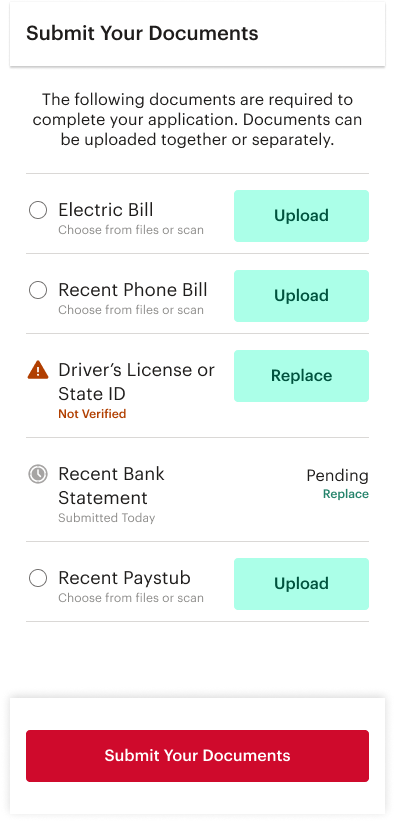
Example Submission Error:
The Drivers License status icon shows a document waiting but not submitted. The error clearly says "Upload Error".
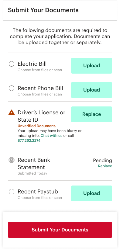
Example Unverified Document:
"Unverified" is better explained. Chat and call info offer next steps. The CSR can walk them through replacing the document.